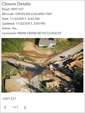
The details element is used to show information about features or rows from a layer. Its display is based on a layer's pop-up information. Each pop-up has four distinct parts: title, content, media, and attachments (see Configure pop-ups for details). When configuring the details element, each of these parts can be switched on or off.
As with all data-driven elements, you can create filters for the details element to limit the amount of information it displays. Also, as with the list element, you can limit the number of features displayed in the details element and sort the order in which features are presented. The latter means that you can, for example, specify that rows with important values for a date-based field appear at the front of the element's carousel. This is particularly important in real-time scenarios.

The details element is especially effective in interactive dashboards as the target of actions. An example of this would be if a selection on a list or a change in a map's extent controlled the data available to be displayed in the details element.